
Global modules
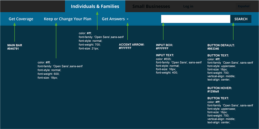
Navigation: Individuals & Families
The Individuals & Families and Small Businesses tabs create a consistent header navigation with the primary difference being color. This allows site visitors to seamlessly toggle between the Individuals & Families and the Small Businesses sections with a visual indicator of the user’s location. Features like the HealthCare.gov user account menu, notifications, and language toggle are available globally.
There are 45px between both the logo and global navigation tabs, and between the secondary navigation text fields. Primary navigation tabs have 30px of horizontal padding, while secondary navigation buttons have 20px interior horizontal padding. Secondary navigation hover states have white background and blue text, while the active state has blue background and white text.


Individuals & Families Spanish
The same specifications used for the English header apply to the Spanish version.


Individuals & Families header styles
All text within the global header is Open Sans. The primary navigation tabs are 21px in size with a font weight of 700. The secondary navigation buttons are 18px with a font weight of 600. The search button text is 16px with an uppercase font style.
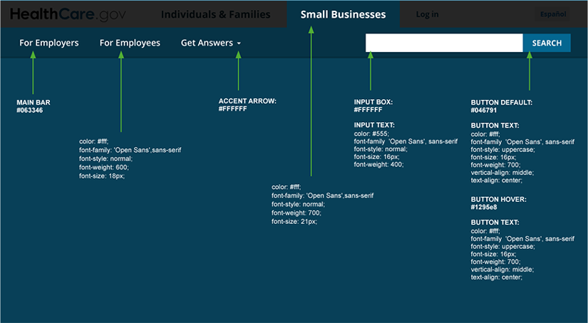
Navigation: Small Businesses
The Small Businesses tab and secondary navigation follow the same specifications outlined in the Individuals & Families section above.


Small Businesses header Spanish
The same specifications used for the English header apply to the Spanish version.


Small Businesses header styles
The same styles used for the Individuals & Families global header apply to the Small Businesses version.
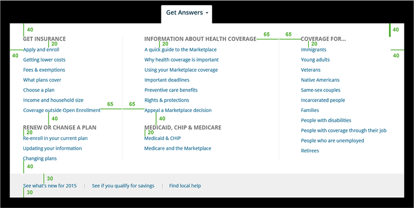
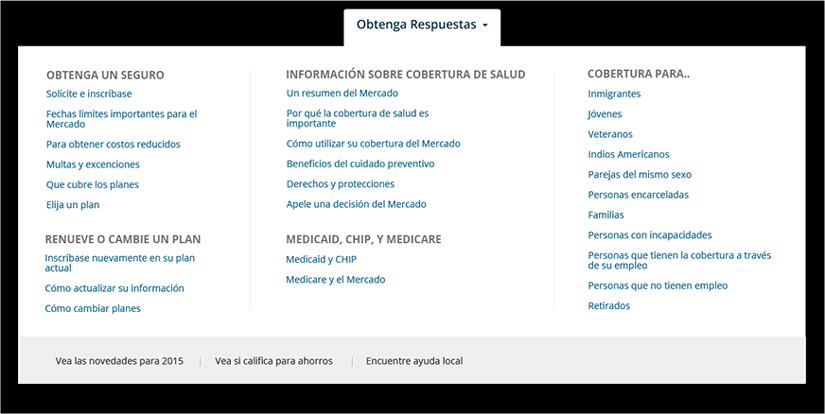
Mega menu
The mega menu is available under the Get Answers button. Both the Individuals & Families and Small Businesses sections of the site have a Get Answers mega menu, providing a way to navigate to information applicable to either section.
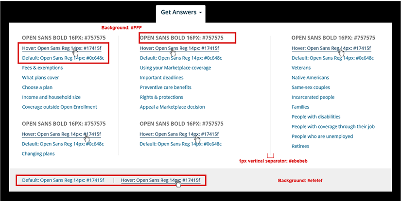
The mega menu uses the Open Sans font at 16px for titles and 14px for lists. The title colors are #757575, links are #0C648C, and hovers are #17415F. There is a 40px interior margin all around and 40px vertical space between each set of links. There are 20px between subsection labels and links, and 65px between columns and vertical separators. The additional links at the bottom of the mega menu have 30px vertical spacing above and below the text.
Top hat
The top hat version of the main navigation appears on pages and applications that are meant for both the Individuals & Families and the Small Businesses audiences. While the majority of content on HealthCare.gov is aimed at one audience or the other, there are exceptions such as the site map and the Find Local Help tool.

Footer
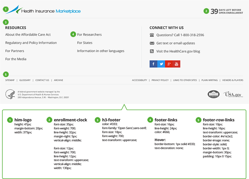
The footer displays the “Health Insurance Marketplace” logo at 375px wide. All text in the footer is Open Sans using color #333. The countdown clock font sizes are 35px and 12px. The H3’s are 18px uppercase, and the footer links are 16px. Additional evergreen links are also provided in one row at 10px uppercase.
Mini-Footer
The mini-footer appears primarily on HealthCare.gov applications. It also appears on select content pages that are meant for both the Individuals & Families and the Small Businesses audiences.