
Hero
The hero module is the main messaging area for the first-tier landing page templates. The main hero space has a minimum height of 380px, and should react to the user's browser. The image within the hero container should always scale up or down depending on the browser size, mobile or tablet views.
Hero design
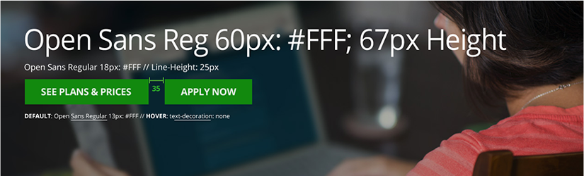
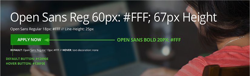
The hero module uses the Open Sans font at various sizes in white #FFF. The H1 is 60px, the subhead text below it is 18px, and the "kicker" text below the CTA button(s) is 13px. The hero module is designed to display up to two primary CTA buttons, when two are displayed there is 35px space between buttons. When the primary alert appears it is centered and top aligned. The secondary alert appears to the right, top aligned with the H1.
Default specifications

Alert specifications

Secondary alert specifications

Styles
Styles Dual Primary CTA's